Elizabeth Collection Lookbook Spring/Summer 2015
Hello fellow Blogreaders!
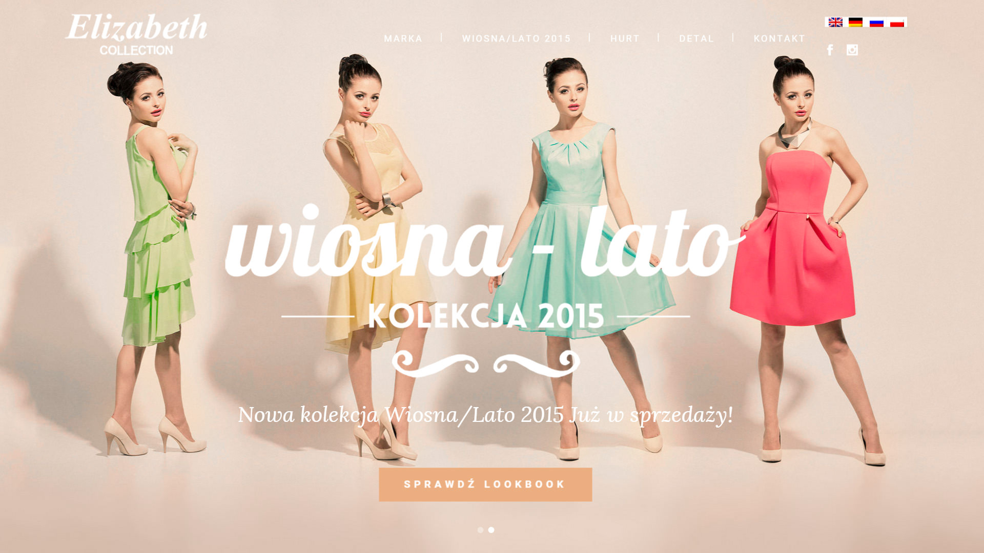
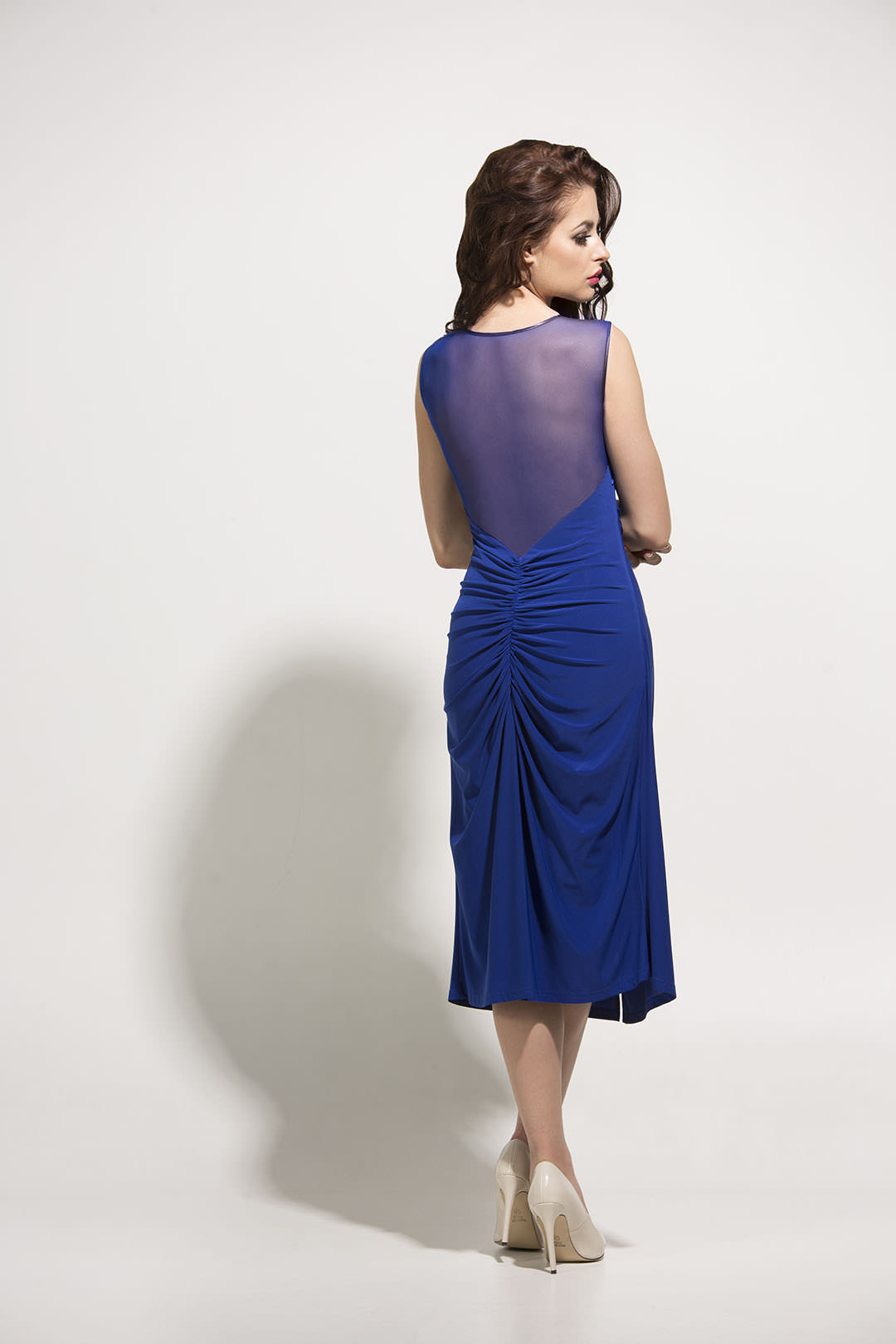
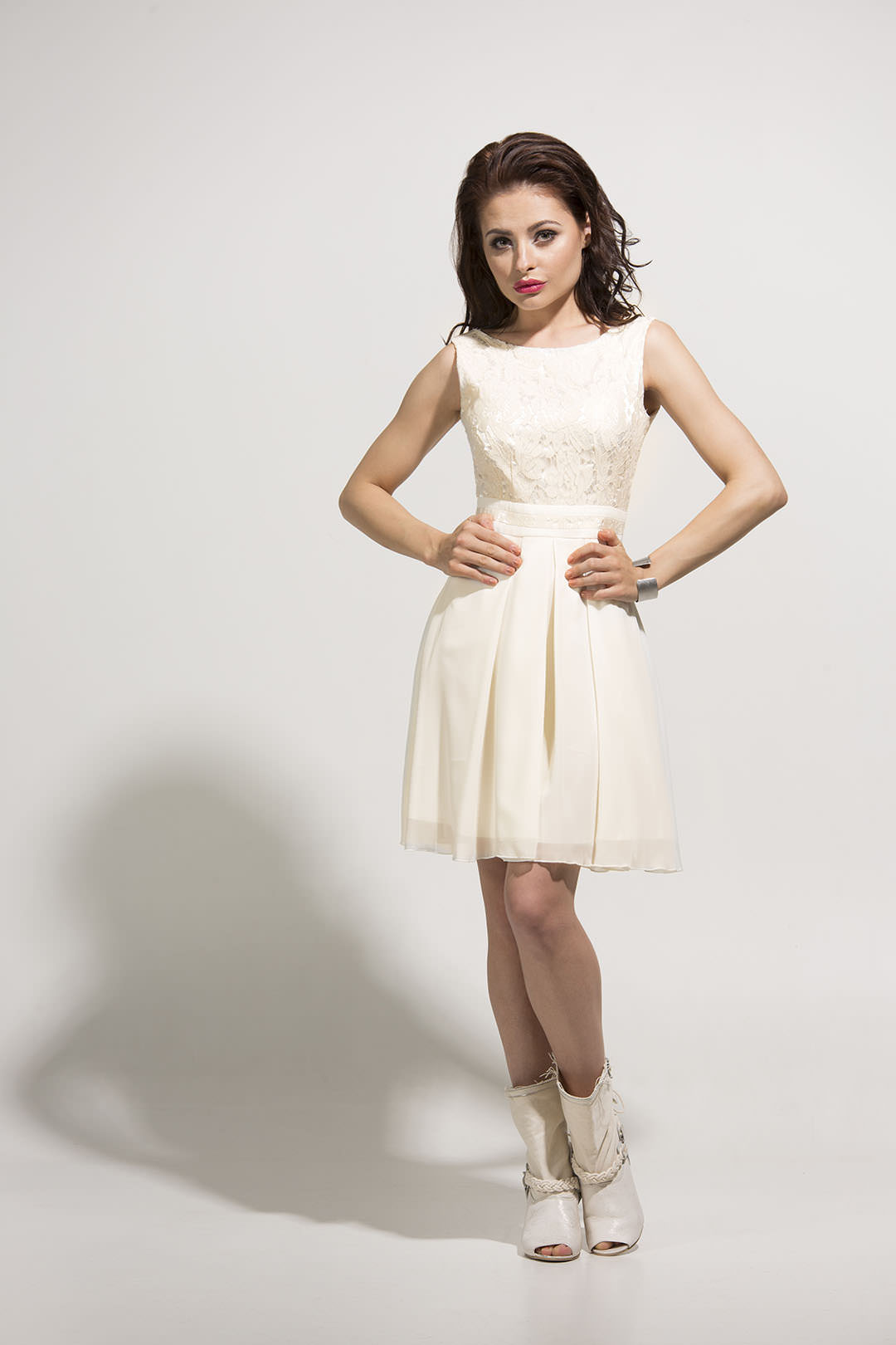
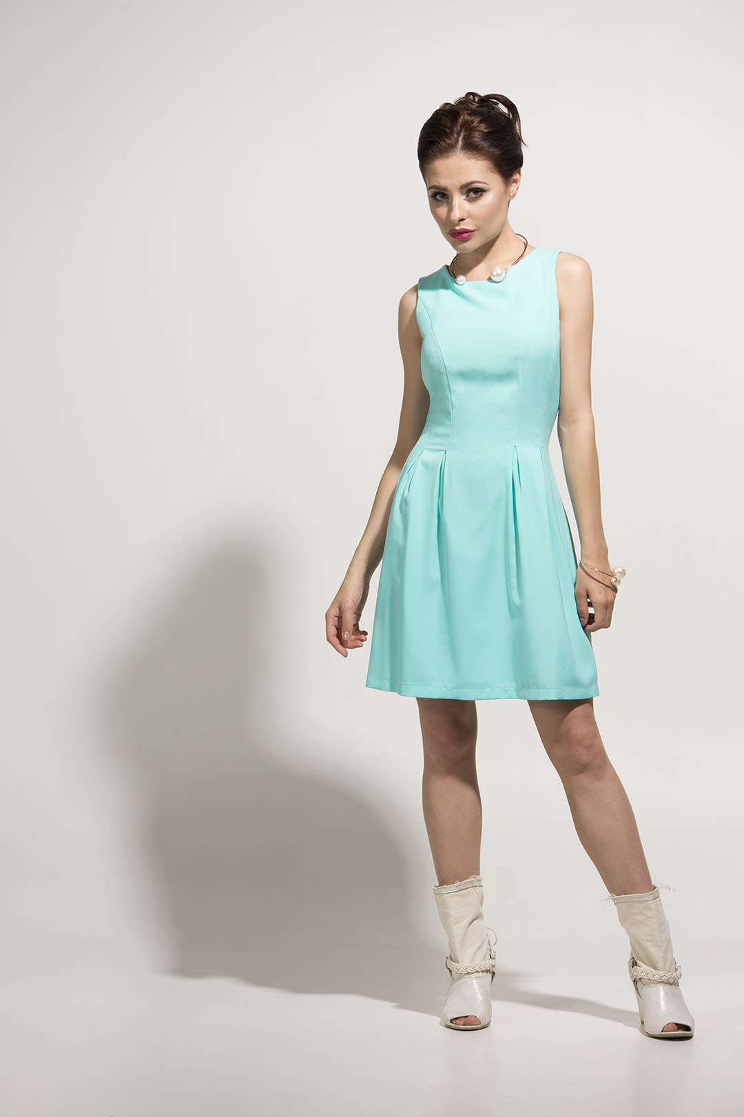
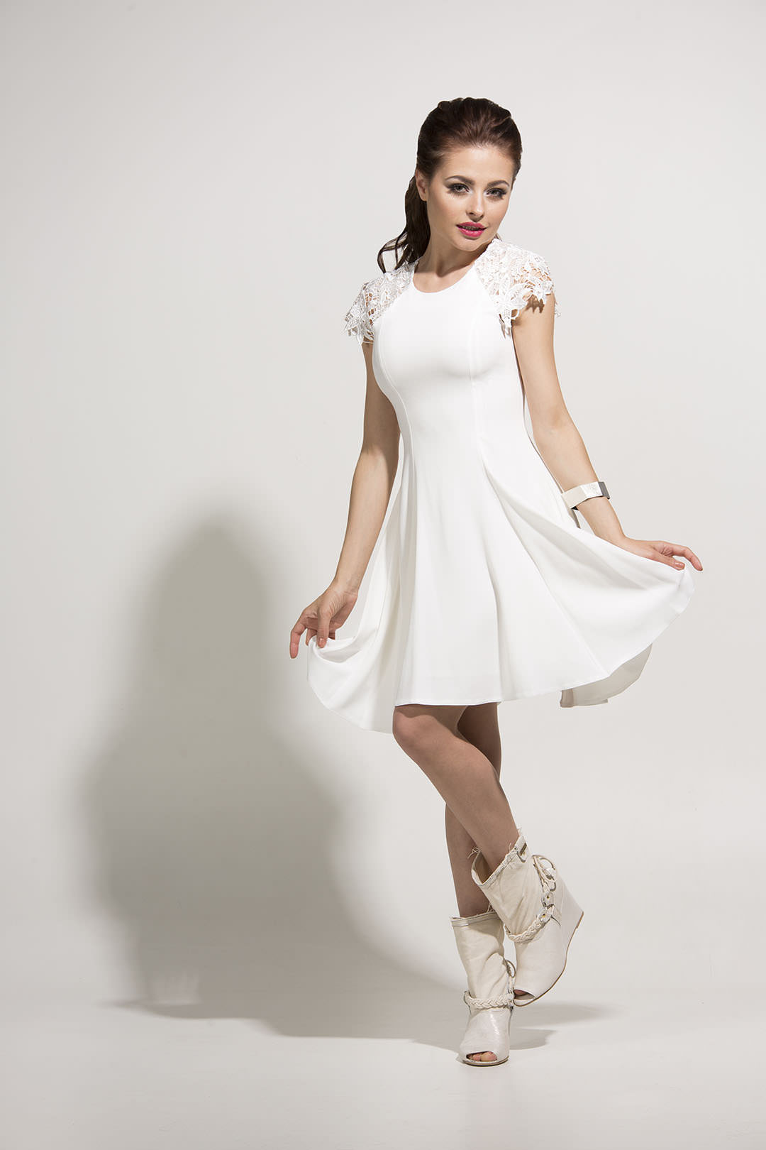
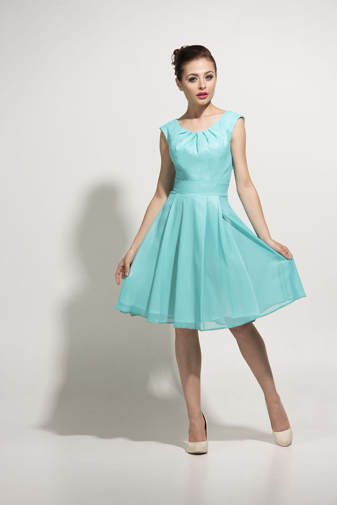
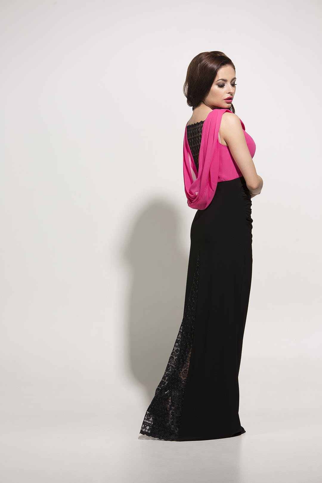
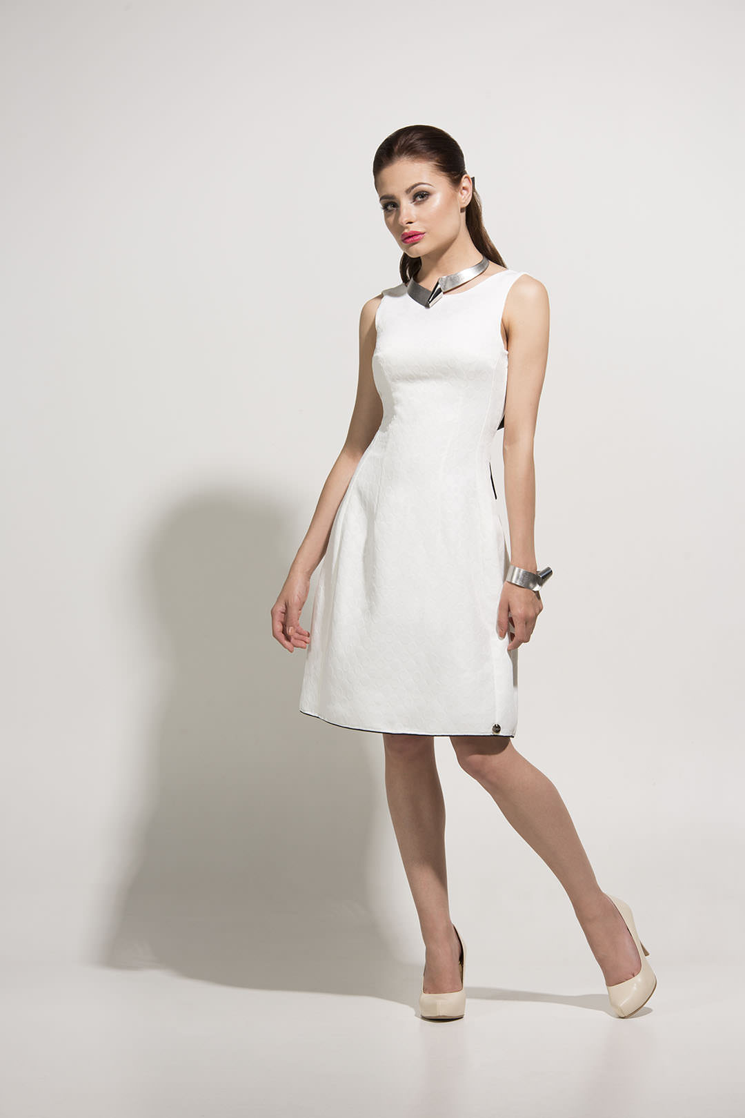
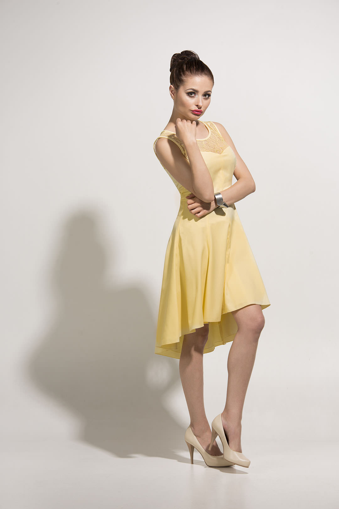
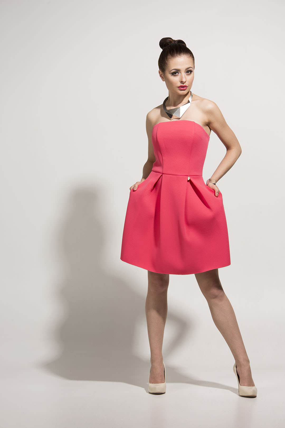
Today’s post is about one of my biggest commercial jobs. My Muse and I have made a complete brand refresh for Elizabeth Collection, which included: lookbook session, new website, refreshed logo, catalogue and leaflet.
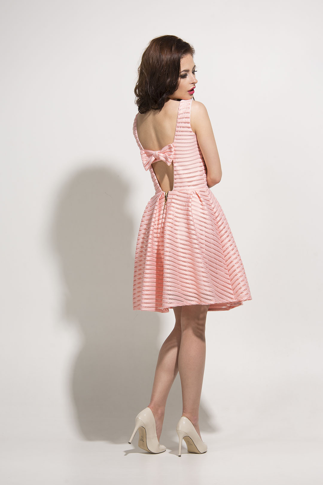
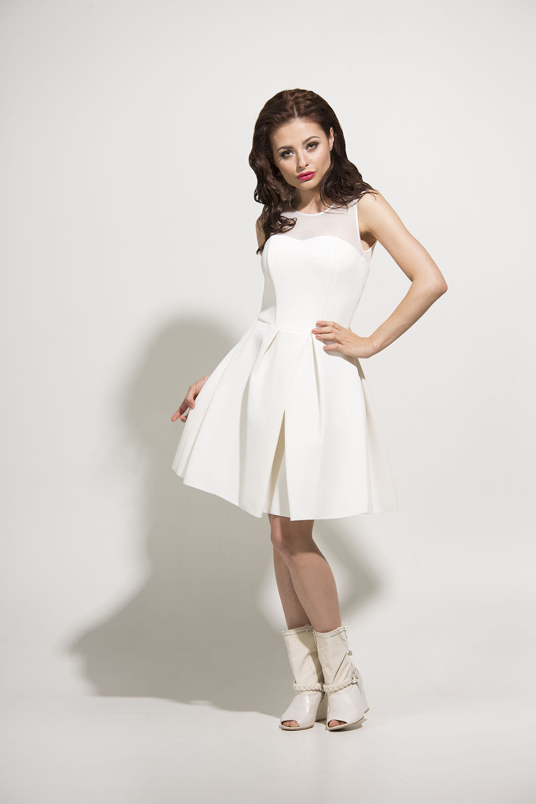
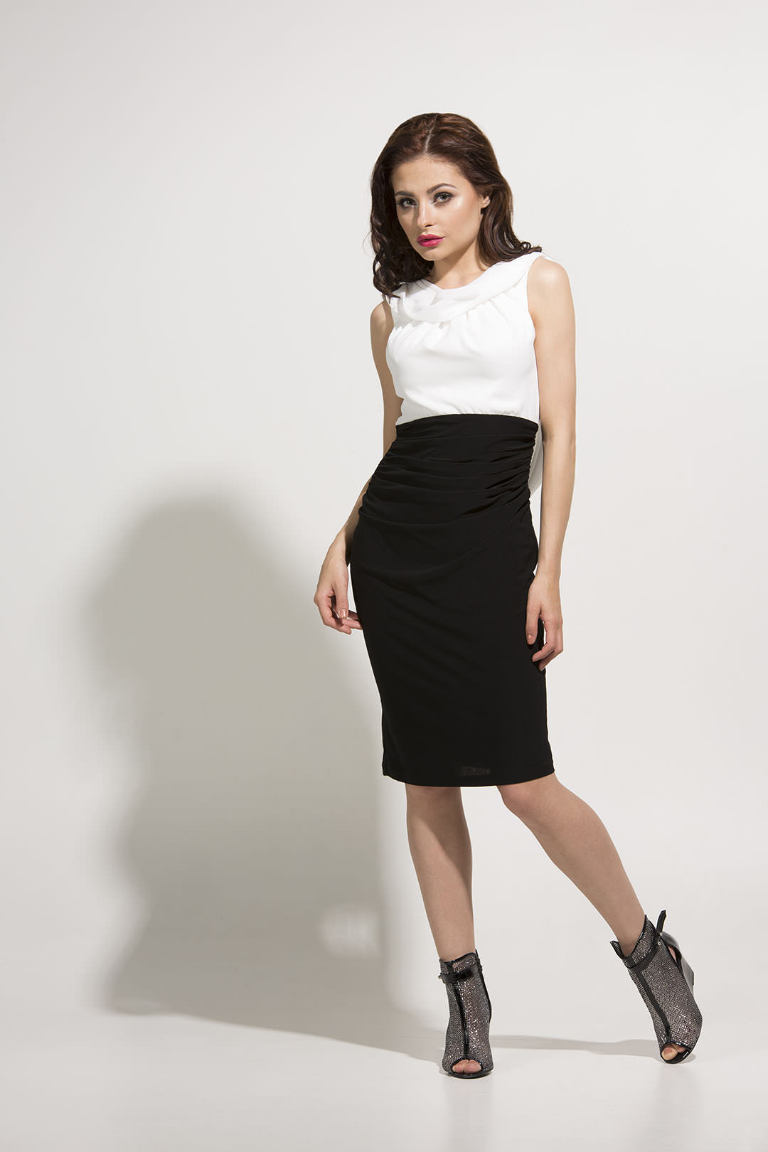
At the end of this post there is a description of the lighting, which is interesting because I’ve never used this kind of lighting before. When I was configuring it, I wanted to create a Summer mood, and I built it for making another lookbook, this time for clothing company Elizabeth Collection – Spring/Summer 2015 collection. The whole thing contained 36 models of dresses, so I decided to show you only my favourite ones.
But first, the team:
– the company was represented by it’s owner, Mrs Elżbieta, and her mother, Mrs Bożena, nice and warm women, very commited to what they do,
– the model was Paulina Szydłowska – an experienced model, who really knows what she does, working at an express pace wasn’t anything new for her! 🙂
-the hair and make up were cared for by Iza Kolanowska, with whom I wanted to cooperate for a long time and I finally had a chance to do it 🙂
-on a few of the photos you can see jewellery from my befriended designer Aleksandra Przybysz – ALE!.
The lighting is described at the end of this post, but in the meantime check out the lookbook:
Technical Stuff:
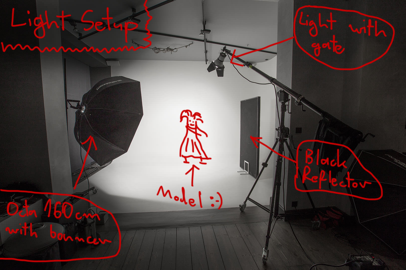
As I mentioned at the beginning, when I was configuring the lighting, I wanted to give the collection a Summer, holiday look. To achieve that, I decided to use a very simple lighting, which consisted of only 2 light sources:
– the main light was a lamp with a silver reflector and a gate put on, standing on a boom light stand on the right side of the model, it’s job was pretending to be the Sun. It produced bright light, but also dark shadows. Because of where the lamp was standing, the whole thing has a classic rembrandt shape,
– on the other side I put an octa 160xm with a bouncer, it’s job was to fill the shadows and to give more realistic, summer look to the light.
You can see the whole setup on the picture below.
I encourage you to experiment with hard light. The advantages are photos sharper than those made with using softboxes, and the sunny feeling of the light. The disadvantage are dark shadows, which almost always have to be filled in with something in order to not become black spots that you can do nothing about in postproduction.
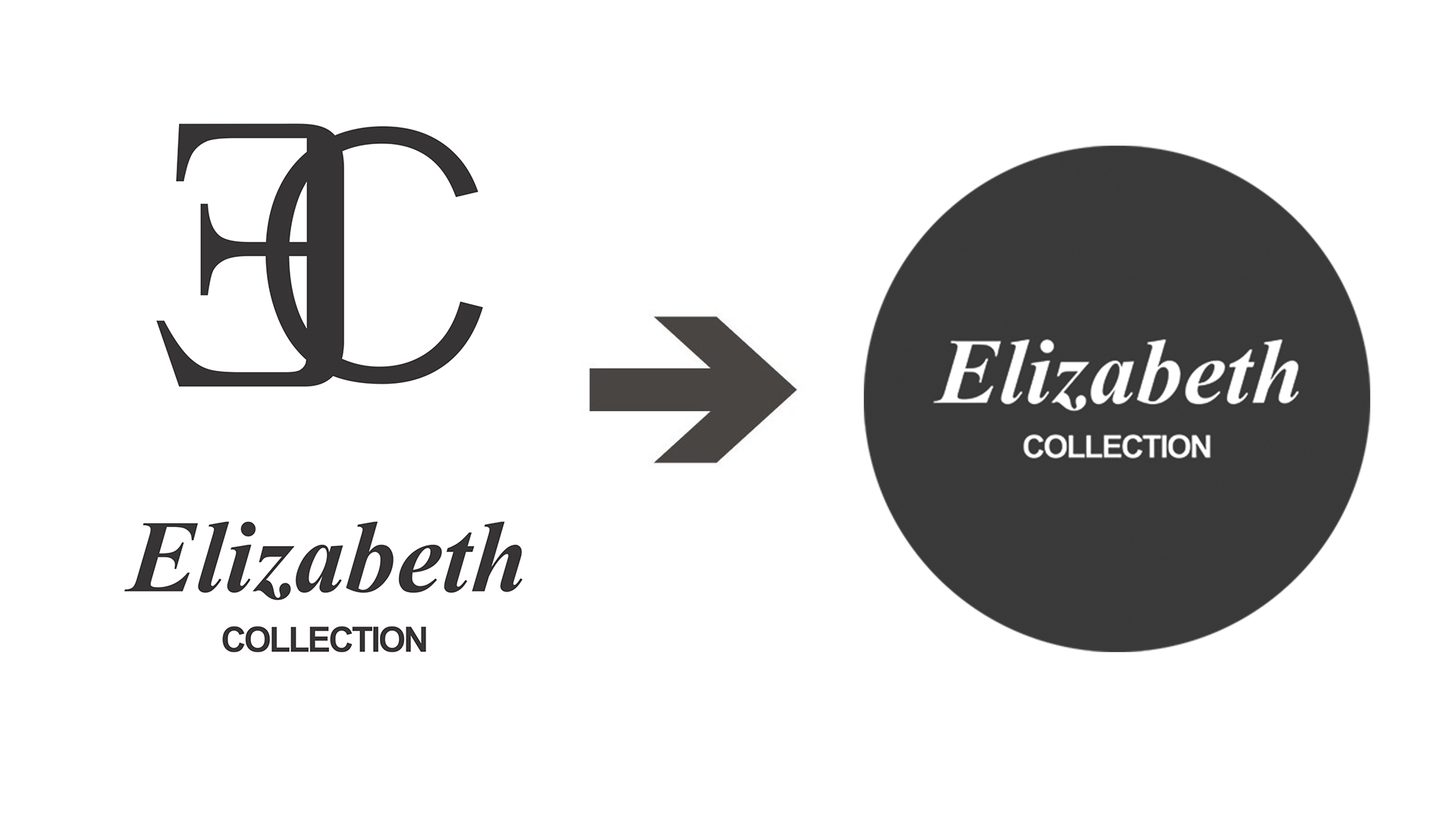
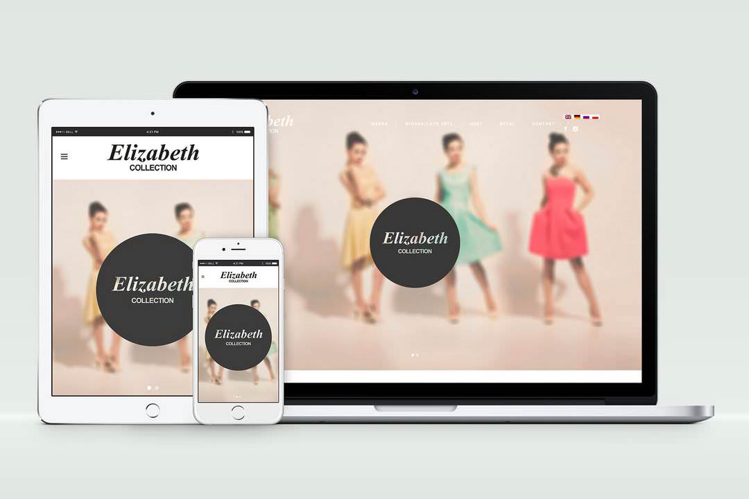
This is how the site and logo have changed. The catalogue made by my Muse you can find at the website (everything is ready in 4 different languages!) – please check out the new www.elizabeth-collection.pl.
Have a good light!
Leave a Comment